In many real-life situations, scatter plots follow patterns that are approximately linear. If y tends to increase as x increases, then the paired data are said to be a positive correlation. If y tends to decrease as x increases, the paired data are said to be a negative correlation. If the points show no linear pattern, the paired data are said to have relatively no correlation. |
|
Setting up a scatter plot
Example: Is there a relationship between the fat grams and the total calories
in fast food? (refer to the data below)
Sandwich |
Total Fat (g) |
Total Calories |
Hamburger |
9 |
260 |
Cheeseburger |
13 |
320 |
Quarter Pounder |
21 |
420 |
Quarter Pounder with Cheese |
30 |
530 |
Big Mac |
31 |
560 |
Arch Sandwich Special |
31 |
550 |
Arch Special with Bacon |
34 |
590 |
Crispy Chicken |
25 |
500 |
Fish Fillet |
28 |
560 |
Grilled Chicken |
20 |
440 |
Grilled Chicken Light |
5 |
300 |
|
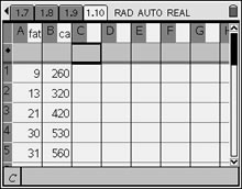
1. Enter the Fat grams into column A of the spreadsheet. Label the column "fat". Enter the Calories into column B and label the column "cal". Be sure you have the same number of entries in both columns.
(See Lists and Spreadsheets for entering data in lists.)
 |
Once the data is entered, there are two ways to obtain a scatter plot.
METHOD 1: (Data & Statistics)
2. Graph the scatter plot. From HOME, choose #5 Data and Statistics. Hit ENTER.
Using the Nav Pad, arrow to the bottom of the screen and choose the x-variable to be "fat". Then move to the left side of the screen and choose the y-variable to be "cal". You will now see your scatter plot.
|
|
METHOD 2: (Graphs & Geometry)
2. From HOME, choose #2 Graphs&Geometry. From MENU, choose #3 Graph Type and #4 Scatter Plot, as seen at the right.
Hit ENTER.
3. At the bottom of the screen, highlight the box naming the set to be used for the x-values, click, and choose "fat". Use your TAB key to highlight box if needed. Do the same for the y set and choose "cal". |
|
|
|
|
4. From MENU, choose #4 Window and #9 Zoom Data, to set the window for the plot.
Hit ENTER. |
|
|
|
|
In both methods, visual examination shows a positive correlation between the total grams of fat and the total calories. (The graph resembles a straight line rising to the right.)
Let's move on to "line of best fit" and see how the calculator can find the best equation to represent this data. |


![]()